
The Task
I was recently tasked with designing a dice game app from scratch, for iOS.
The client asked for a very brief turnaround, possibly a one digit number, possibly in the lower end.
The main requirements for the app were:
– show dice clearly on the screen.
– include the current score.
– when the user rolls a double (both dice hit the same number), display a “Double” message and double the score (i.e. if both dice hit 2, double it returns (2+2)x2).
– create appropriate deliverables so that both the dev team and the major stakeholders will understand the game.
With this list, I set out to create the best game I could.
Adding on to the requirements
The first question I asked myself was “Ok, but where’s the game exactly?”. I could not figure out where the app would generate any fun by simply rolling the dice.
To solve this issue in the simplest, fastest way possible I added a timer, with a fixed 60 seconds. The logic works as follows:
– the player must roll the dice as many times as possible during 60 seconds.
– the player must score higher than the previous Best Score.
This was simple enough to guarantee at least an engaging MVP.
With this modification, I quickly went back to the client and communicated the timer addition. It was approved right away, so I moved on to do some quick UX.
Research and Wireframes
To start off on the right foot, I decided I would take a quick look at what’s out there. With “out there” I mean, look at the games on my iPhone.
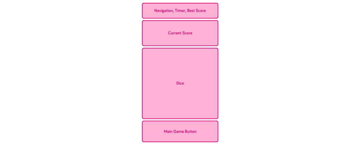
I don’t play games that much, but by looking at the ones on my phone one thing was clear: it’s really easy to understand the different interactive blocks of information.
I took inspiration from a couple of apps and I established an information scheme.
Before moving on to the wireframes, I felt something was missing: the actual name of the app. I had an idea and tagline in mind for the app:
Dice-A-Roni
All you can roll in 60 seconds!
It sounded silly and fun enough to incorporate that into the wireframes.
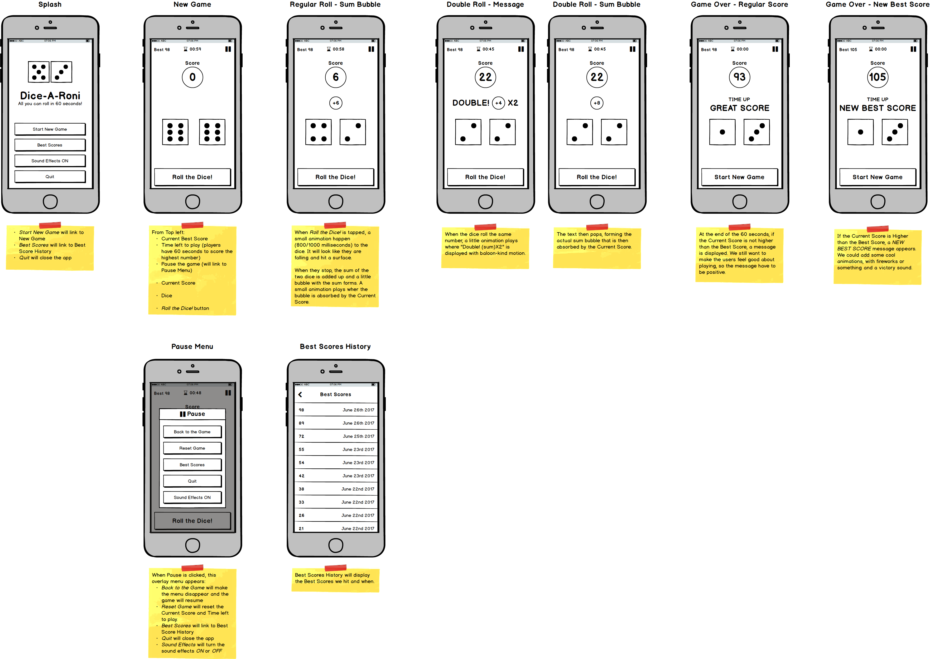
Now I felt confident enough to move forward with the wireframes.
It didn’t take long before I had the main game screens down. I added options for sound effects and animations too.
After that, I started thinking about a small navigation and I created an overlay menu for it.
Hi-Fi Mockups
With the wireframes on my side monitor, I opened Sketch.
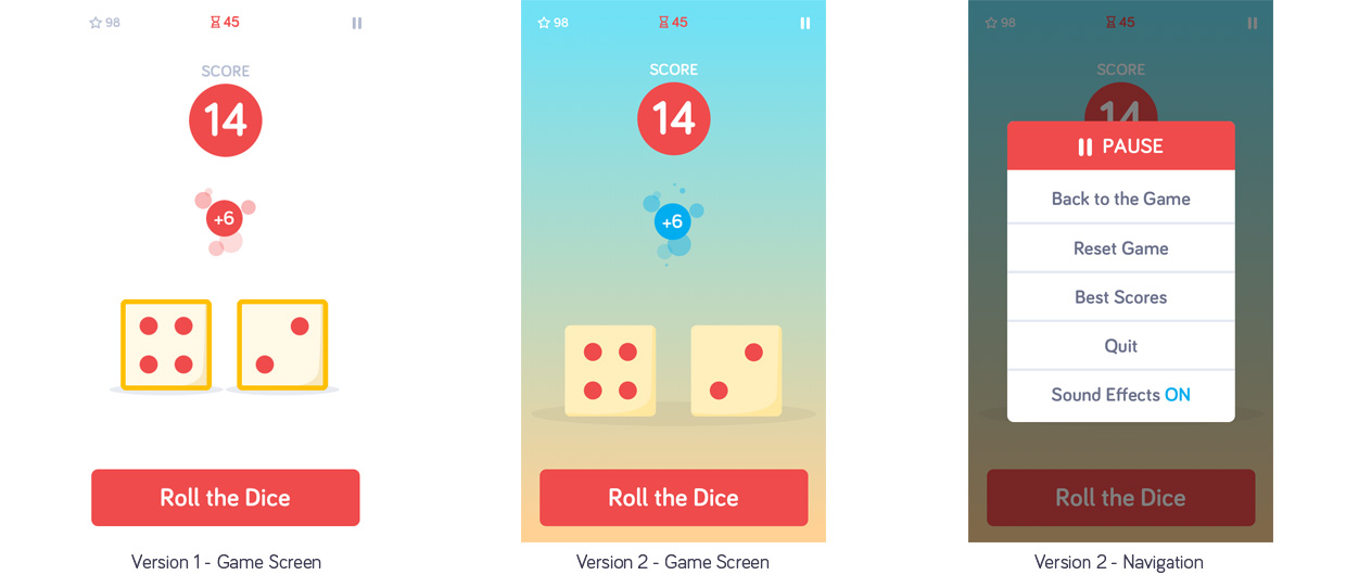
I really needed to create mainly two screens: game screen and navigation screen.
I tried a very basic version one, but I wasn’t too happy with it. It looked flat and lacked some dynamics. I played around with background colors, and I redesign the dice.
I felt I was on to something, but to make sure I was, I took a 20-minute break to “freshen up” my eyes. This step is key: constant, non-stop, meticulous design creates a sort of “confirmation bias”. Everything looks great and impactful. You go to bed, go back to the computer the day after and no, it actually doesn’t look great.
After the break, I came back to the computer, liked what I saw and made a few last adjustments.
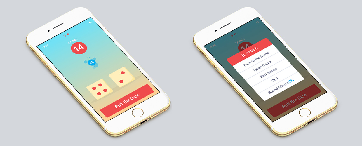
Of course, to present it to the stakeholders, I had to come up with an iPhone mockup.
This is also a very underestimated step.
Some clients are going to have a tough time seeing the screens in action. Now, to avoid any confusion or iterations based on this very problem, I created two iPhone 7 mockups to illustrate how cool the app would look once it’s up and running.
Long-term Strategies and Monetization
To add to the designs, I also presented a long-term gaming strategy and monetization option.
Game Strategy
1. Add second touch point to increase the level of complexity of the game. it could be that every X points, a bubble appears on the screen at a random point (in the Dice section) and, if the user is fast enough to tap it, x points are added.
2. Add option to share the score to Facebook, Twitter and Instagram (screenshot).
3. Add multi-player option to challenge friends and family.
4. Add option to change the background image. I.e. top world locations monuments (Paris, NY, Tokyo, etc.), themes (Halloween, Christmas, etc.), current popular show/cartoons (Rick and Morty, Attack on Titan, etc.).
5. Create Dice Coins and place them on the screen for the users to collect.
6. Increase game engagements by allowing to tap each die directly. This will allow creating i.e. poisoned dice that, if tapped, decrease the points. Also, we could add dice up to 4, and this will force the game to be played in landscape mode.
7. Explore AR possibilities.
Monetization Strategy
– Charge a small amount ($ or Dice Coins) for dice skins. I.e. skulls instead of dots, or emoji instead of dots.
– If 6. above is implemented, then it could be possible to add safety packs or Band-Aid for when i.e. a poisoned die is tapped OR to cancel any negative effect applied to the Current Score or Dice Coins.
Conclusion
Dice-A-Roni was a lot of fun to design. I had a lot of limitations and constraints to work with:
- Lack of direction, clarity, and vision from leadership
- The app is not user-tested, so we are not sure how it will perform in the wild
- I am not sure we are solving for anything
- Due to the unreasonably quick turnaround, I had no official research to go off of, just some secondary one
