
Intro
Some of the main funnel patterns of a retail website involve searching.
Searching is done for a few different purposes, the main ones being spearfishing, followed by browsing and finding inspiration (abstract needs).
These cases obviously depend on the intent of the customers, wether they have a product or need in mind, they are passionate about fashion, etc..
This project was generated through some customer feedback discovery of my own, coupled with the support of the User Research team.
Trigger
Digging deep into our text analytics tool, I found a common pattern and extracted some of the Customer verbatim:
- “…even better search. I was looking for wide hiking shoes for women, and got a bunch of unrelated items, and many hiking shoes that did not have wide options.”
- “more searchability by style”
- “Narrow searches a little easier.”
- “…and you need a faster way to search, spending a ton of time here narrowing down…”
The trend focused on “narrowing down” more than browsing or solving for abstract needs. This finding pointed at a spearfishing Customer, and helped me scope frame the problem better.
Problem
Customers have to initiate a search and dig through results to find what matters and is valuable to them. They feel frustration when searching takes longer than expected. We are not making it easy on them.
How do we facilitate the finding process?
Scope
I decided to run a quick Design Sprint with a couple of fellow UX Designers, Engineers and a User Researcher.
This exercise helped the scoping of the project, and for a quick value-proving MVP, we thought it would be a good option to start with Search Autocomplete.
I then moved on to write a hypothesis to test against.
Solution Exploration
The Autocomplete feature of the search on Zappos could offer more than just a series of search terms.
What if we added more information about products in the drop-down, thus potentially eliminating a click, enhancing the pre-search experience, and even facilitate browsing?
Could showing a sub-set of results (that can be top, featured or personalized) in the autocomplete portion of the search field, help solve this problem?
Hypothesis
IF we show top tier results inside of the Search Autocomplete field
THEN we’ll see a positive trend in Customer Satisfaction for Searching as well as funnel metrics
BECAUSE spearfishing Customers will find products in a faster, lower-frustration process
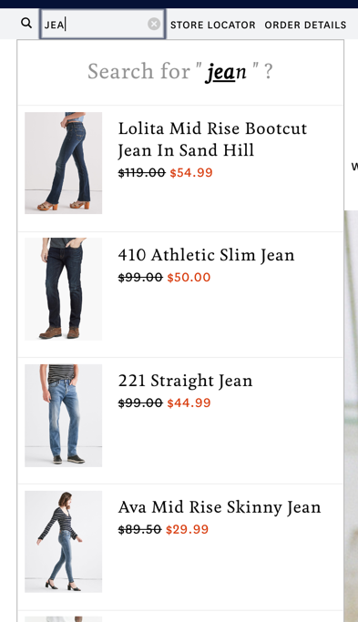
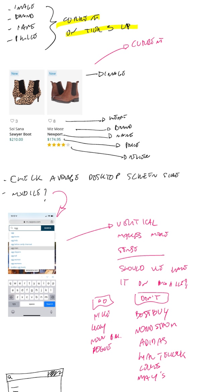
Currently on Zappos
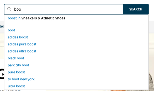
Functionality
This is proprietary information of the Data Science and Search teams, but essentially keywords are chained together based on a variety of customer behavior.
Impact
Our understanding of Search Autocomplete is limited. This is what the Analytics team had to say:
“From our analysis, a total of [considerable]% of the revenue can be attributed to the customers who interacted with search engagement in the last year.
A total of [considerable]% of the visits by the customers who interacted with search contributed to the total orders”
Analytics
Analytics has shown how a lot of the clickthrough rate to Product Page from Search Page, happens within the first 1-2 rows of products. Could we perhaps surface the first few items of a SERP in the Autocomplete, thus decreasing time to Product Page? And could this be a better browsing option (think Chinese restaurant menu w/ pictures)?
Secondary Research
Nielsen Norman Group Article: https://www.nngroup.com/articles/site-search-suggestions/
“Consider if this type of complex search-suggestion dropdown would be helpful for your users, or confusing overkill. If you do adopt this approach, your suggestion dropdown should be well organized and labeled. Users should be able to easily scan and understand all of the information presented.
In particular, providing links to related products in the dropdown can be a good shortcut for those who know what they were looking for.”
Competitive Analysis
I analyzed the functionality across 20+ websites. Of these, 10 between competitors and non-competitors, display search results in the search autocomplete.
Adidas
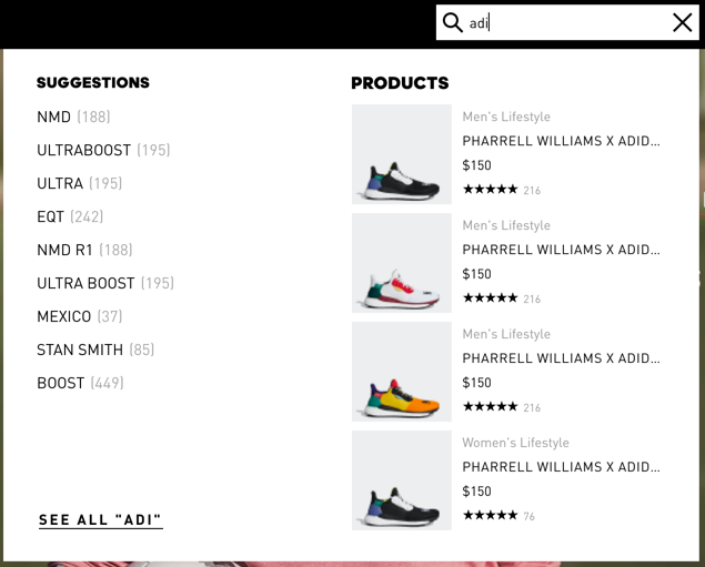
Adidas separates Suggestions and Products vertically, clearly marking them.
Product Features:
- Image
- Category
- Name
- Price
- Star Rating
- Review Count
Additional Features
- “See All [query]”
- Category list with Counter under Suggestions.
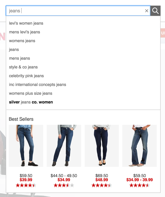
Best Buy
Bets Buy separates Autocomplete from Products vertically. Their autocomplete seems to be working like Zappos’.
Product Features
- Image
- Brand
- Name
- Star Rating
- Star Average
Additional Features
- Products change according to hover over terms in Autocomplete.
Hautelook
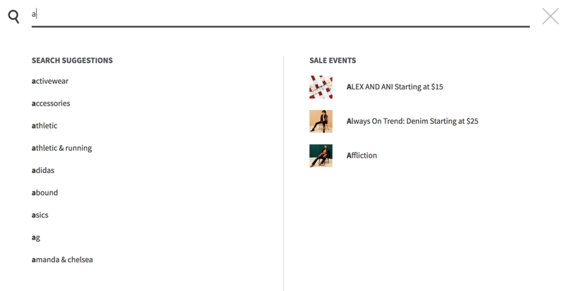
Hautelook separates Search Suggestions from Sale Events vertically, clearly marking them.
Product Features
- Image
- Brand
- Starting Price
Lowes
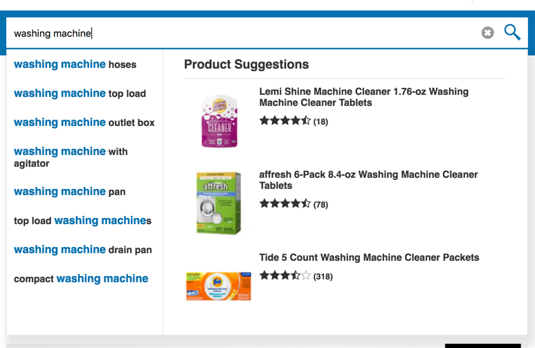
Lowes separates Autocomplete from Product Suggestions vertically, marking the right side clearly.
Product Features
- Image
- Brand
- Name
- Star Rating
- Review Count
Additional Features
- Products change according to hover over terms in Autocomplete.
Lucky Brand
Lucky separates Autocomplete from Products horizontally.
Product Features
- Image
- Name
- Price
Additional Features
- Autocomplete spells out the predicted word missing letters
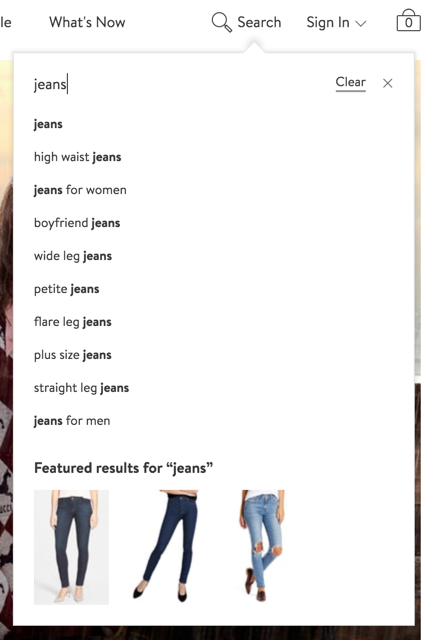
Macy’s separates Autocomplete from Best Sellers horizontally, clearly marking the latter.
Product Features
- Image
- Price
- Star Rating
Additional Features
- Products change according to hover over terms in Autocomplete.
New Balance
New Balance separates Related Searches/Related Categories from Top Results for [query] vertically, clearly marking them.
Product Features
- Image
- Name
- Category
- Price
Additional Features
- View All button
Mobile Version

Nike
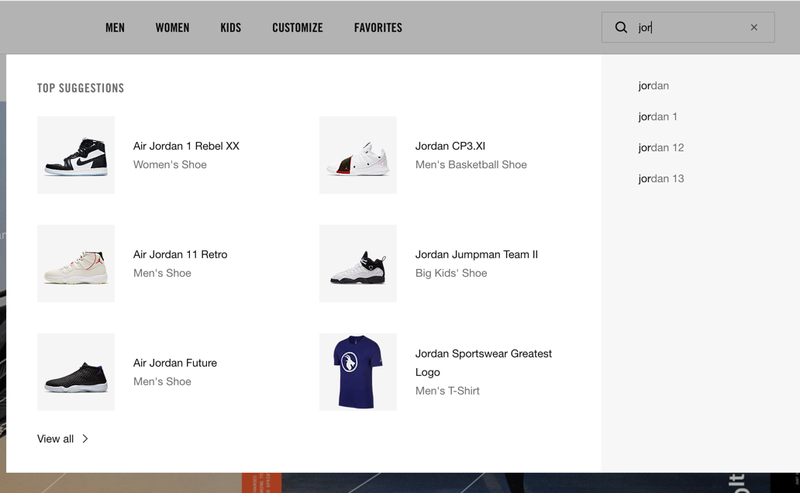
Nike separates Top Suggestions fro Autocomplete vertically, marking the former clearly.
Product Features
- Image
- Name
- Category
Additional Features
- View All link
- Products change according to hover over terms in Autocomplete.
Mobile Version

Nordstrom
Nordstrom separates Autocomplete and Featured Results for “[query]†horizontally, marking the latter clearly.
Product Features
- Image
Additional Features
- Products change according to hover over terms in Autocomplete.
Rogue
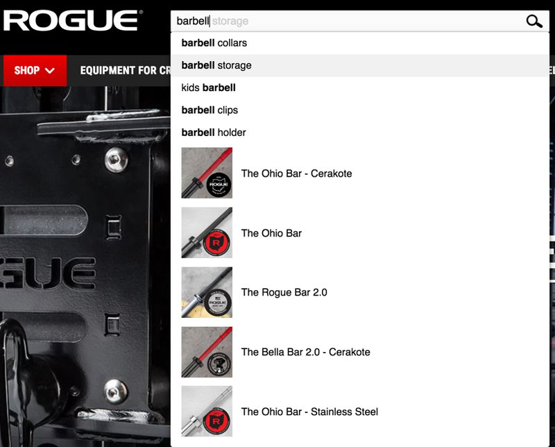
Rogue does not separate Autocomplete from Products.
Product Features
- Image
- Name
Additional Features
- query in search will look complete by hovering over Autocomplete terms
Analysis Takeaways
Most of the websites seem to have as similar pattern. The shared elements between them are:
- 10/10 Image
- 7/10 Name
- 5/10 Price
- 4/10 Star Rating
- 3/10 Category
- 3/10 Brand
- 2/10 Review Count
We also have a few Additional Features shared between competitors, the most frequent being:
- 5/10 Products change according to hover over terms in Autocomplete
- 3/10 View or See All
Most of the websites (7/10) mark the Autocomplete and Products.
Regarding the # of products shown for each term, we have an average of 4.5, with a max of 6 and a min of 3.
Only 4/10 websites carried the functionality to mobile web. The remaining 6, keep the autocomplete but have no search results embedded in it.
Design Exploration
To Keep in mind
User Goals: faster spearfishing, easier browsing (think menu with images), engagement with search
Business Goals: streamlined funnel, increase exsposure to PDP, positive trend in DSI, increase conversion
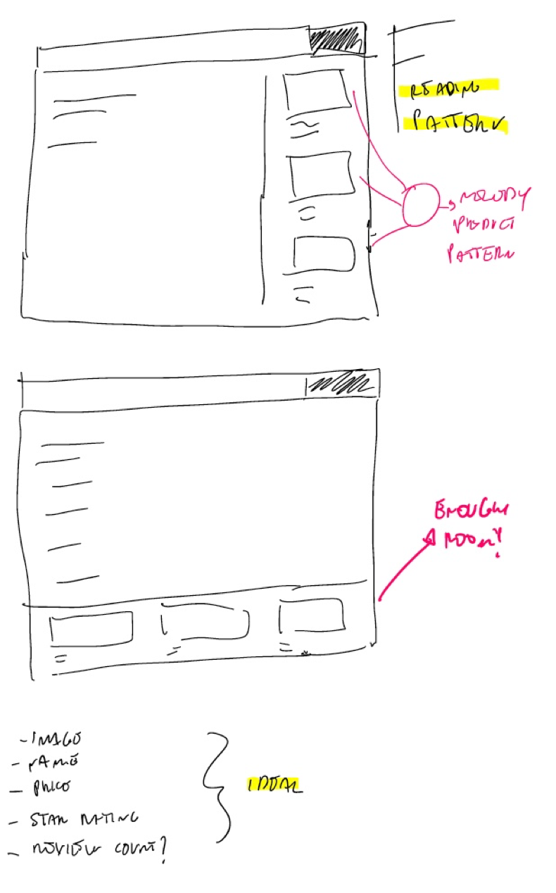
Sketches
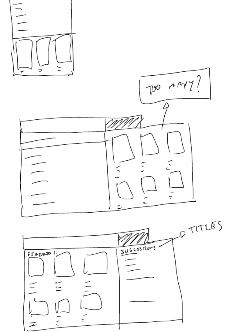
Refined Hi-Fi Wires
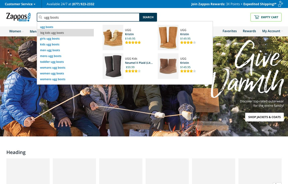
Zappos Homepage.
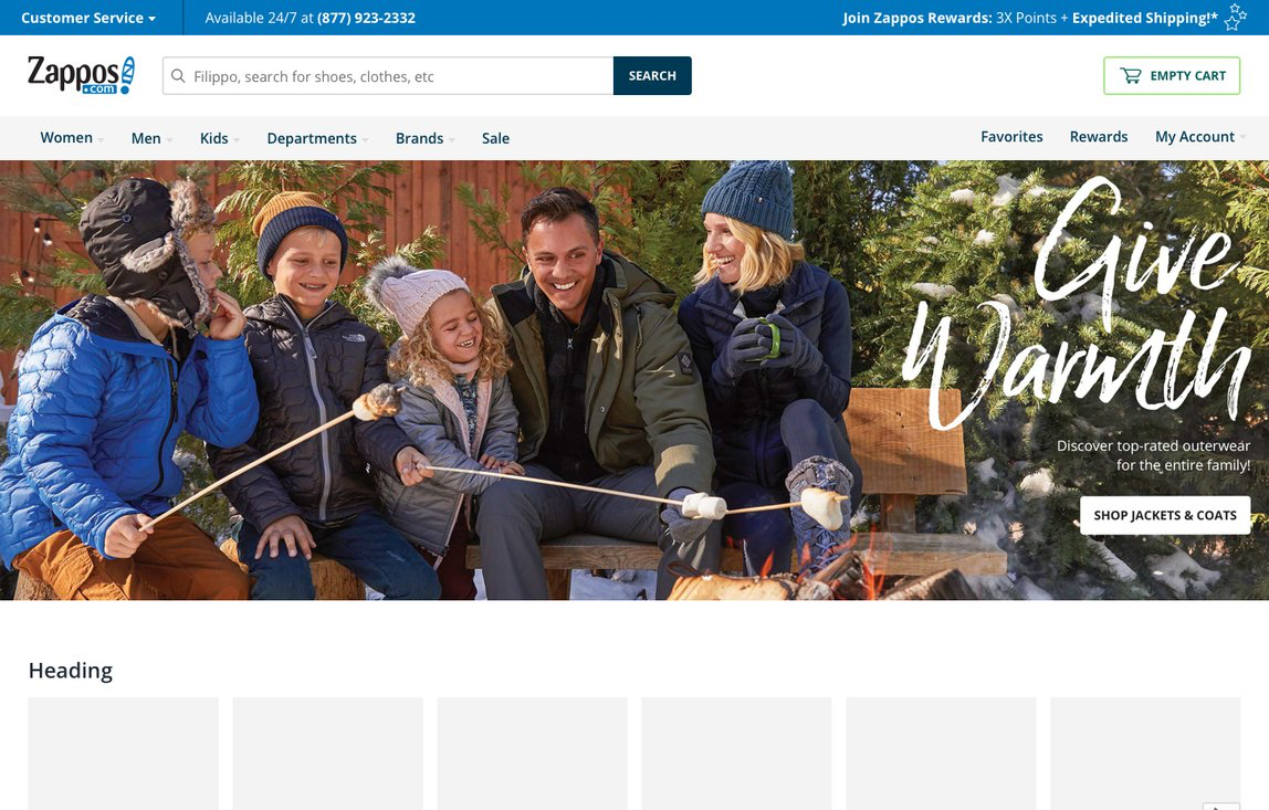
I used our Design System patterns to build out the experience.
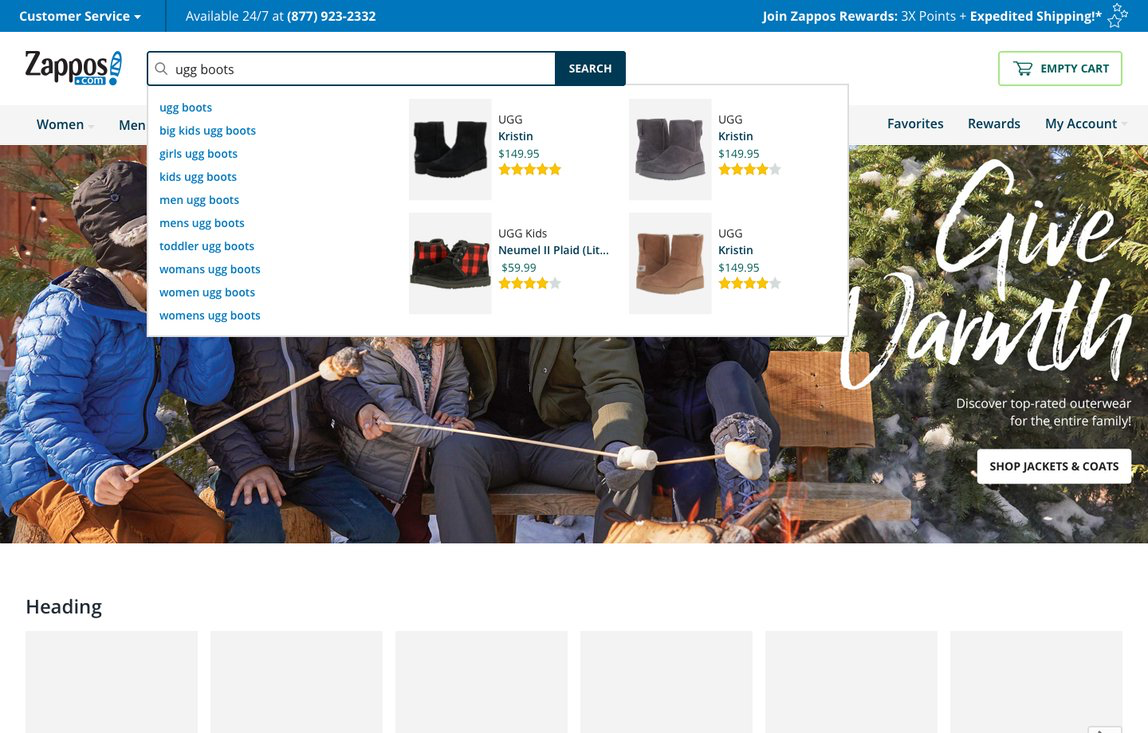
Customer searches for ugg boots
Customers hover over one of the terms
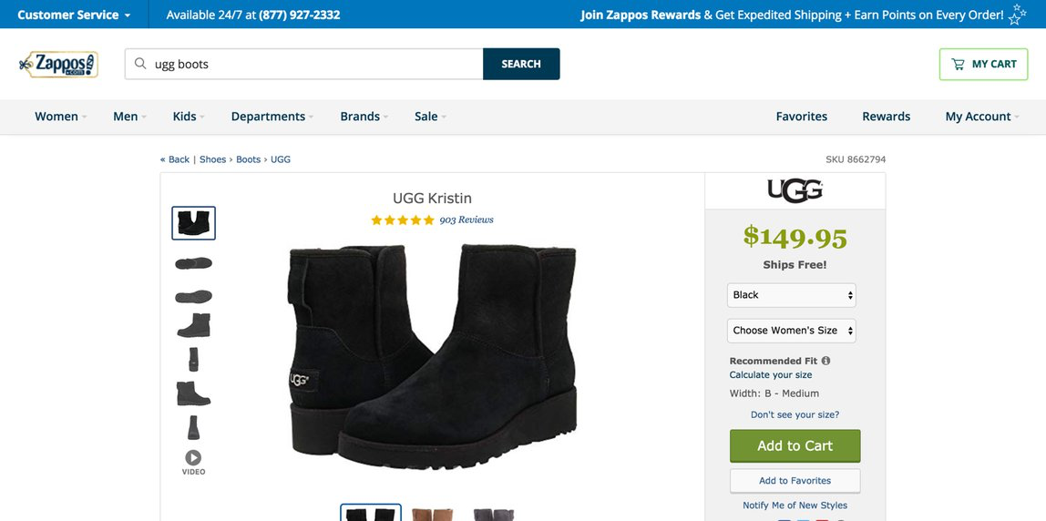
Customer clicks on one of the results and lands on Product Details
Limitations and Constraints
- Although Autocomplete is an important feature, [medium-lowish]% of Customers land from Google searches. How do we help them with this issue when they most likely (thanks Analytics) have a Product Page hopping pattern?
- This is a “farmer” type of project. Let’s look at innovative ways to solve the problem after we prove value with this one
- What are we doing for the browsers and abstract-needy customers?
- We need to test how this is going to impact search timing and load. We are loading a set of results in it, is autocomplete going to slow down?
- What is mobile going to look like?
- Currently, this implementation is a low-hanging fruit between design, engineers and search team. Let’s monitor funnel metric and iterate accordingly
- Need a deeper dive on error states
- I used an existing pattern from our Design System, because the amount of time and resources we have do not allow for researching a new, reusable pattern that could be added to the library (see Governance)
Next Steps
The first round of A/B testing produced good results. Currently in pipeline queue.
